The Challenge: A Unified Employer Brand
BGE needed a recruitment piece that did more than list job openings—it needed to sell a career path. The goal was to consolidate their diverse service lines into a single, cohesive narrative that would resonate with students.
BGE needed a recruitment piece that did more than list job openings—it needed to sell a career path. The goal was to consolidate their diverse service lines into a single, cohesive narrative that would resonate with students.
The Solution: "Build. Grow. Excel."
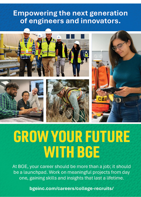
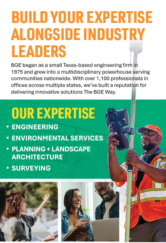
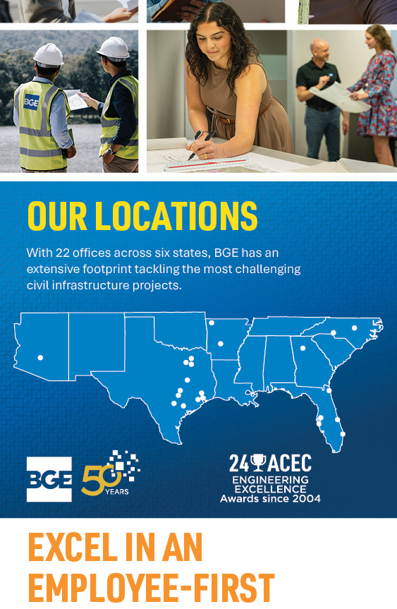
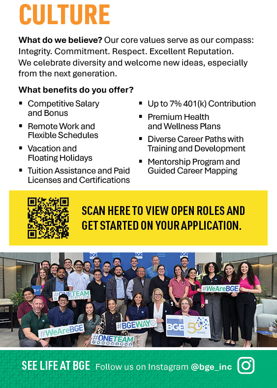
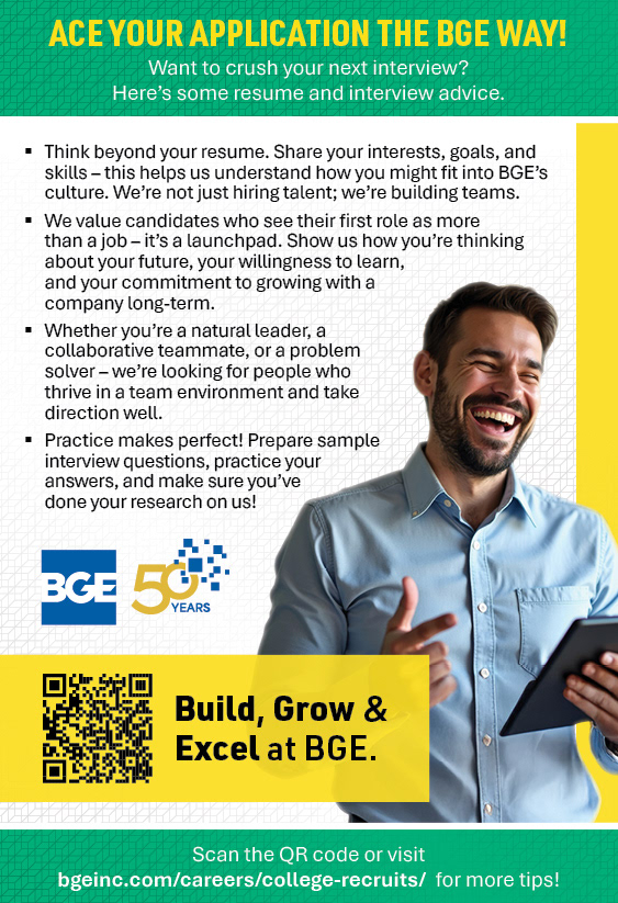
I designed a custom pocket folder to serve as the flagship takeaway for the recruitment team. Utilizing the company acronym (BGE), I developed the campaign’s core mnemonic device: Build your expertise, Grow your future, and Excel in an employee-first culture. The interior spread details the comprehensive benefits package and company culture , while the back panel offers tangible value to students with an "Ace Your Application" interview guide. Structurally, the pocket format allows recruiters to customize the package for each candidate, adding specific job descriptions or business cards while keeping the core brand story intact.
I designed a custom pocket folder to serve as the flagship takeaway for the recruitment team. Utilizing the company acronym (BGE), I developed the campaign’s core mnemonic device: Build your expertise, Grow your future, and Excel in an employee-first culture. The interior spread details the comprehensive benefits package and company culture , while the back panel offers tangible value to students with an "Ace Your Application" interview guide. Structurally, the pocket format allows recruiters to customize the package for each candidate, adding specific job descriptions or business cards while keeping the core brand story intact.

Domination at Scale
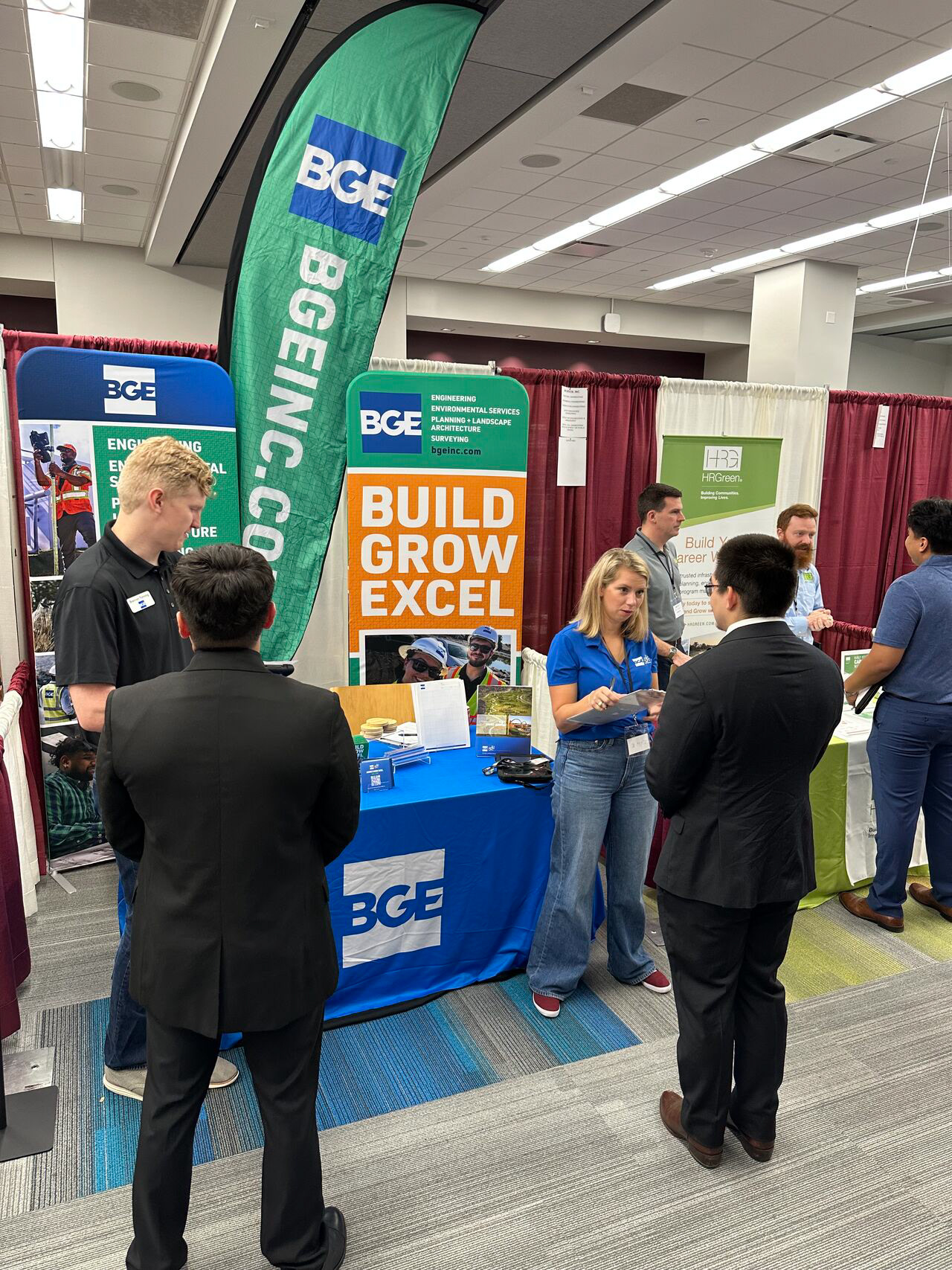
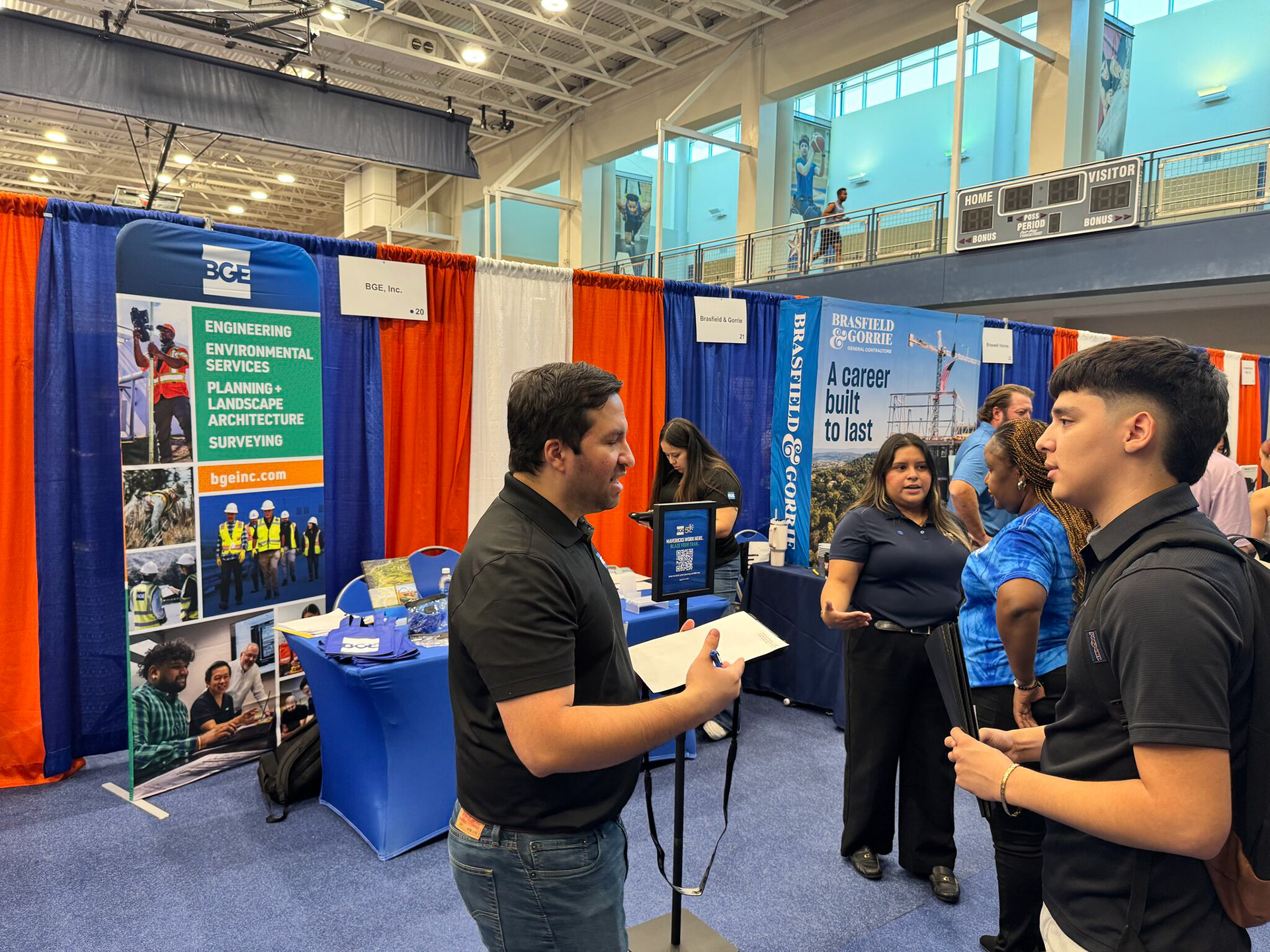
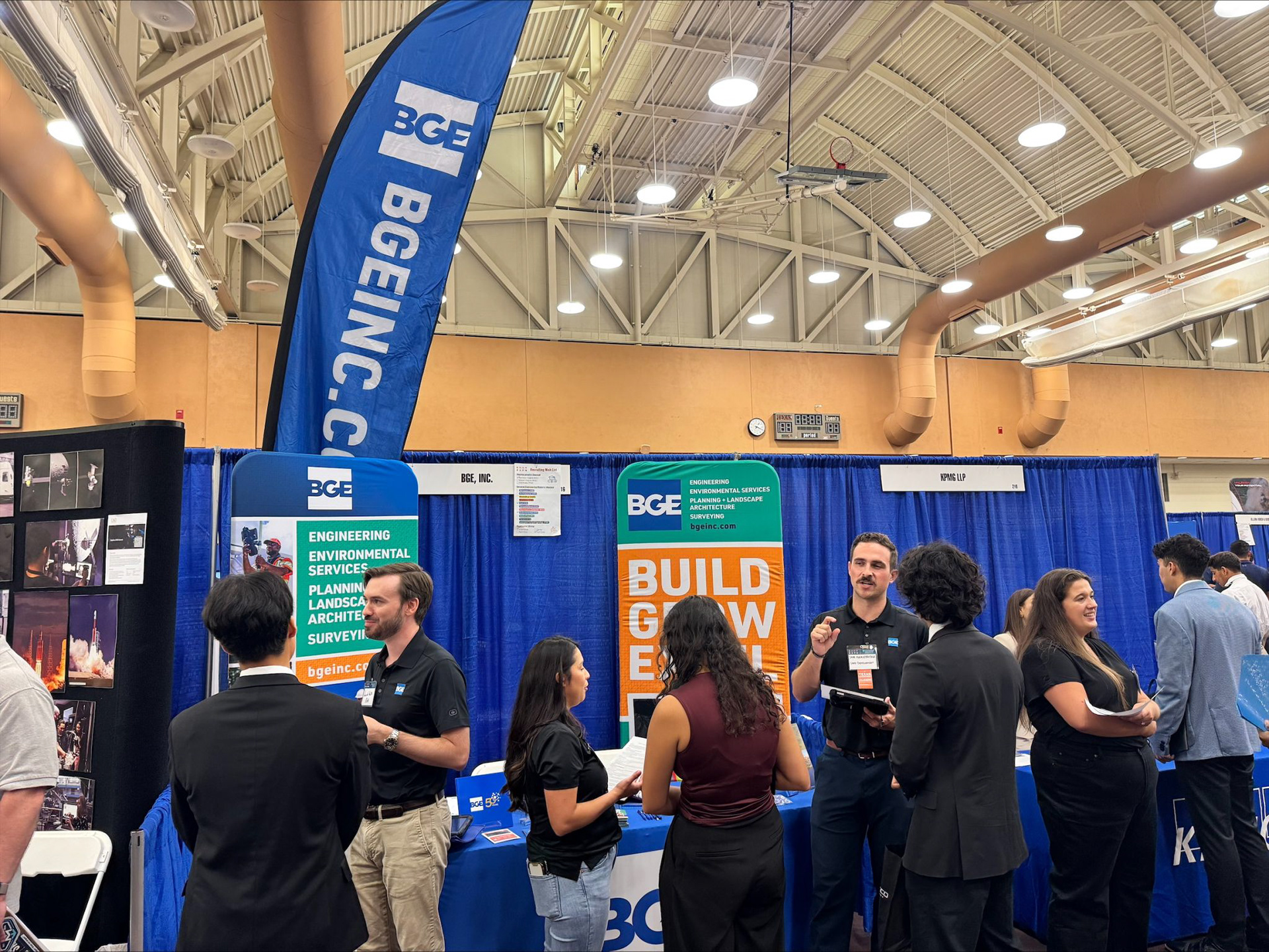
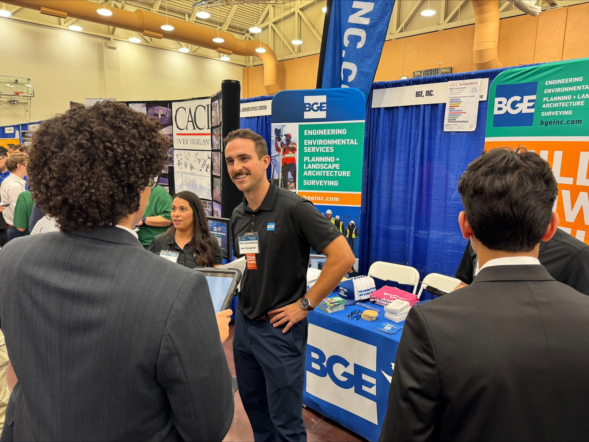
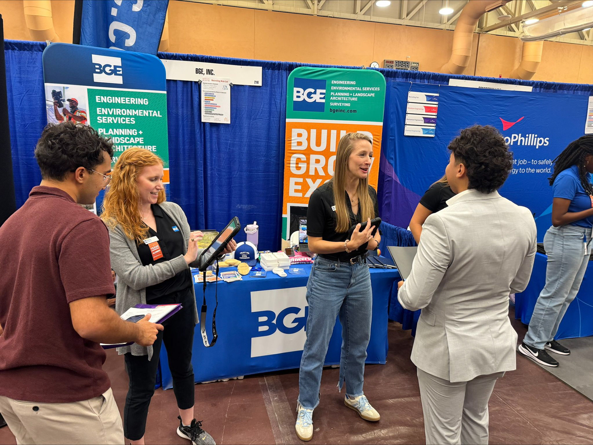
In a crowded expo hall, readability is everything. I designed the large-format environmental graphics to cut through the visual noise of the arena. Moving away from standard vinyl retractables, we utilized Eurofit tension fabric displays to create a seamless, premium look without the glare or hardware of traditional banners. I designed the artwork with a "top-heavy" visual hierarchy to ensure the BGE logo and key messaging remain visible above head-height in crowded aisles. By mirroring the brochure’s grid system and typography, these assets create a unified visual footprint that extends the brand experience from the aisle to the tabletop.
In a crowded expo hall, readability is everything. I designed the large-format environmental graphics to cut through the visual noise of the arena. Moving away from standard vinyl retractables, we utilized Eurofit tension fabric displays to create a seamless, premium look without the glare or hardware of traditional banners. I designed the artwork with a "top-heavy" visual hierarchy to ensure the BGE logo and key messaging remain visible above head-height in crowded aisles. By mirroring the brochure’s grid system and typography, these assets create a unified visual footprint that extends the brand experience from the aisle to the tabletop.
